BLOG
The Anatomy of a Website Page: Building for Conversion
Bashir Shogbesan
13.10.2025
6min read
When someone lands on your website and everything just feels right—the flow, the visuals, the message—it’s not by accident. It is the result of a clear, thoughtful structure. Every great website follows an anatomy: a set of key parts that work together in harmony to attract, inform, and ultimately convert visitors into customers and clients.
Think of it like designing a highly efficient house. The placement of the rooms, the doors, the lighting, and the overall layout all serve a specific purpose. A website page works the same way. Each section has a specific job, and when they function in harmony, the experience for your visitor feels effortless, and they’re naturally guided toward the action you want them to take.
Let’s take a closer look at the anatomy of a great website page and what makes each section matter.
1. The Header: Your First Handshake
Your header is the very first thing visitors see when they land on your page, making it your most critical piece of real estate. It’s your digital handshake: your welcome, your identity, and your navigation guide all rolled into one. A strong header works quickly and efficiently, instantly answering three essential questions for a first-time visitor:
A well-designed header must be simple, mobile-friendly, and, most importantly, consistent across every single page. It should include your clear logo, a clean, minimal navigation menu, and a single, standout CTA button that points visitors toward immediate action, such as “Get Started” or “Shop Now.” Think of your header as the front door to your business: easy to spot, welcoming, and perfectly built to guide people inside.

2. The Hero Section: Your Digital Elevator Pitch
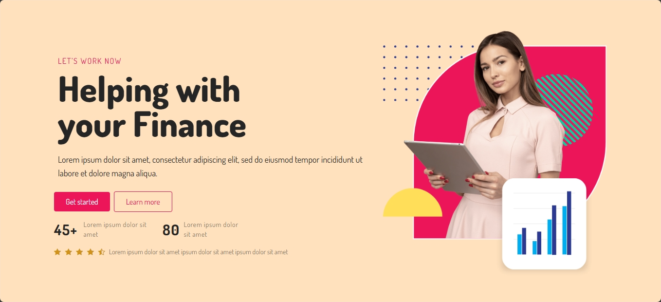
Once your header has made a great introduction, the hero section steps in to seal the deal. This is the big visual area just below the header, and it’s where you show visitors why they should care enough to stay. It’s the section designed to capture their attention, deliver your most important message, and powerfully nudge them to take the next step.
To achieve this, a great hero section needs a few key elements working together:
The hero section is the moment where clarity meets creativity; instead of trying to say everything, it focuses on one thing: getting your visitor interested enough to scroll down.
3. The Body: Where the Story Lives
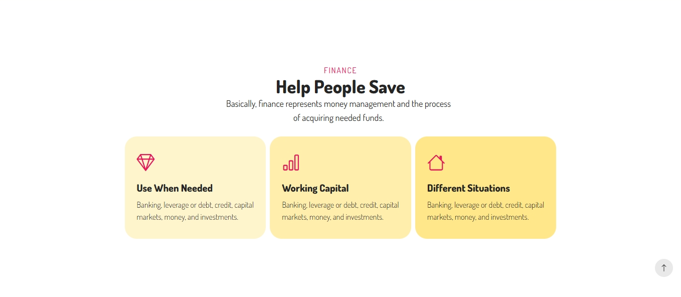
This is the main event, where simple curiosity turns into clarity and understanding. The body of your page carries your core business message, explaining what you do, how you do it better than anyone else, and why those details should matter to the visitor.
To maintain engagement, you should use distinct, well-defined sections, engaging visuals, and shorter paragraphs. The goal is to make the reader feel like each scroll is a step forward in their learning process, not like they’ve hit a confusing wall of text. For instance, you should use icons or illustrations to visually break down complex features, and add clear, descriptive sub-headlines that make scanning the page quick and easy. Don’t forget to include internal links to help users easily explore deeper into related services or products on your site. Think of the body as your primary storytelling space, a place where professional design and compelling content work together to make your message memorable and actionable.
4. The Testimonial Section: Proof That You’re Worth It
Even the most beautiful design won’t drive results if you haven’t given people a compelling reason to believe in you. For you, the owner or creative, the testimonial section is your most powerful strategic tool for earning instant credibility and client trust. This is where you showcase social proof; the real-world validation that tells new prospects, “Yes, this brand successfully delivers on its promises.” This crucial section can include several powerful elements: written testimonials, product reviews, client logos, portfolio success stories, or industry certifications.
This section is a critical conversion booster, regardless of your niche. It’s not just about happy quotes; it’s about overcoming your visitors' natural skepticism. For a creative, it removes the fear of hiring; for a business owner, it overcomes sales doubt. It moves your visitor from the tentative thought of “I like this idea” to the confident conclusion of “I trust this business and I’m ready to act.”
Pro tip: keep it genuine; authentic feedback connects more deeply than overly polished graphics, building the real trust you need to drive action.

5. The Call to Action: Your Turning Point
Your Call to Action (CTA) is the crucial “now what?” moment on your page. It’s the step that smoothly converts a casual visitor into a customer, subscriber, or lead. Remember, a CTA is more than just a colorful button; it is your website’s way of explicitly guiding people toward meaningful action.
To be effective, your CTAs need to be visually dominant and placed logically throughout your page, especially after you’ve finished explaining something valuable. This strategic repetition helps visitors easily take action without having to scroll all the way back up to the header. Keep the text on the button short, clear, and energetic. Use powerful verbs like:
Remember to make the CTA sound human and inviting. Instead of a generic “Submit,” use something like “Let’s Get Started” or “Show Me How.” When people instantly know where to click and feel positive about doing it, you’ve nailed your conversion path.

6. The Footer: Quiet but Powerful
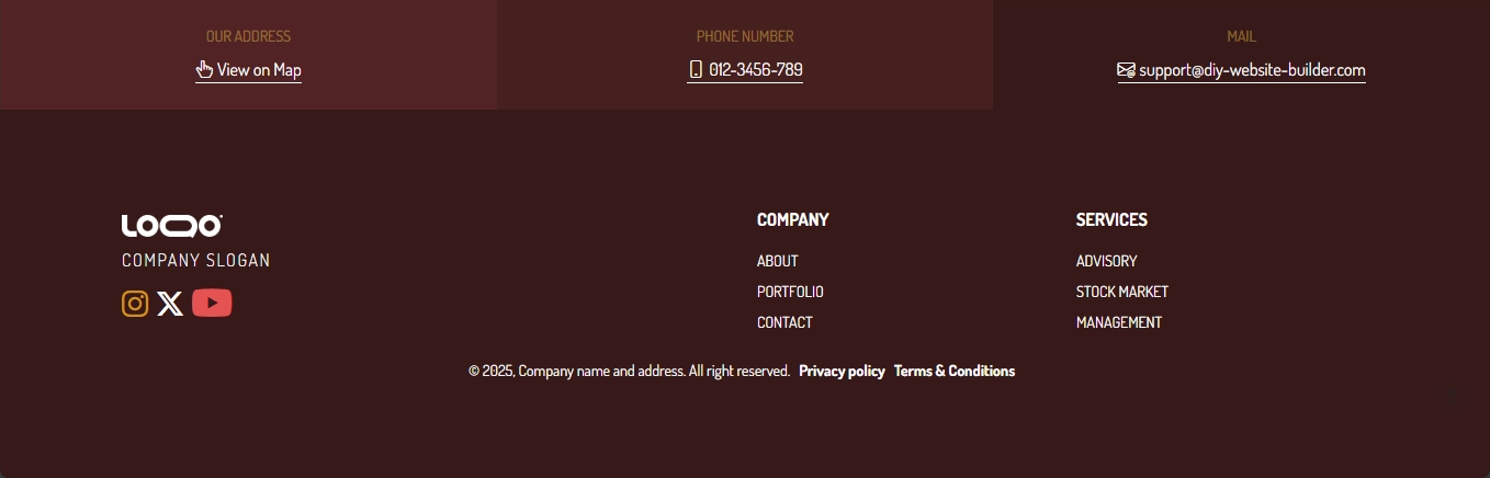
If the header is your first handshake, the footer is your final, reassuring wrap-up. It is the foundation of your page and gives visitors one last, comprehensive chance to connect. While it’s not flashy, the footer is one of the most trusted places people scroll to when they need more information or critical reassurance before finalizing a decision.
A highly effective footer usually includes: quick links to secondary navigation pages (like About Us or Careers), complete contact information, icons linking to your social media profiles, and necessary legal pages such as your Privacy Policy and Terms of Service. It’s also incredibly valuable for SEO and accessibility since it helps both search engines and users find these important details consistently across every page on your site. Think of your footer as the quiet, reliable foundation that holds everything together, your final chance to build lasting trust, and your first opportunity to begin a long-term relationship.
7. The Behind-the-Scenes Elements
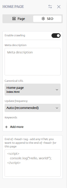
Not everything that makes a great website is something you can see. Some of the most critical parts work quietly in the background, making sure your site is fast, discoverable, and accessible to everyone. These hidden elements directly impact your bottom line.
These elements include: Meta tags and page titles, which are code snippets that help search engines understand exactly what your page is about so they can show it to the right people. Also critical is Alt text—descriptive tags for your images that make them accessible to users with screen readers and improve your site’s SEO. Finally, maintaining fast load times and perfect mobile optimization prevents visitors from clicking away out of frustration and significantly improves your overall ranking on search engines.
With DIYWebsiteBuilder, many of these details are automatically optimized for you, so you don’t have to worry about the technical stuff. Still, it helps to understand how they shape your site’s performance behind the scenes.
When you understand the anatomy of a website page, you’re able to design smarter, not just prettier. You’ll start making better layout choices, writing clearer copy, and building pages that guide visitors exactly where you want them to go.
So, the next time you open the DIYWebsiteBuilder editor, remember: every section of your page has a purpose and a job to do. Start with clarity, build with intent, and then let your powerful, well-structured website do the talking.